What? You didn’t know there were layout options? Allow me to enlighten…

At the top left of your Scrivener window, just to the left of your search button, there’s a button that allows you to choose what shows on your screen. Click on that, drop down to Layouts, and you’ll see that you have seven different options. Here’s what they look like:
Default
The Default layout is the one you’re probably used to. It looks like this:

Three-Pane (Outline)
Clicking the second layout option allows you to open your outline in a panel between your binder and your writing. (For more on the Scrivener outline, see last week’s post.)

You can adjust what shows in the outline by clicking on the little drop-down menu (circled in red here below):

This is super handy if you like to write with your outline open.
Three-Panel (Corkboard)
This is a lot like the layout described above, except that instead of opening your outline in that middle panel, you open (yep, you guessed it) your corkboard.

You can adjust the way the cards display in your corkboard by clicking the icon at the bottom of the screen that looks like four note cards in a square formation (circled in red above).
Pro Tip: Scrivener will fill in the synopsis sections of your outline or cards for you. Just click on the scene in the binder (the column on the left), go to Menu -> Documents -> Auto-generate Synopsis.
Editor Only
This is a pretty simple layout, somewhat like Composition Mode. It aims to minimize distractions:

Corkboard Only
Again, pretty self explanatory, but this puts you into the corkboard view.

You can also enter this mode by clicking this little icon at the top of your screen:

Centered Outline
This option works the same as clicking the little icon immediately to the right of the corkboard icon (in the image above) which gives you the outline layout.

Not much more to say about that.
Dual Navigation
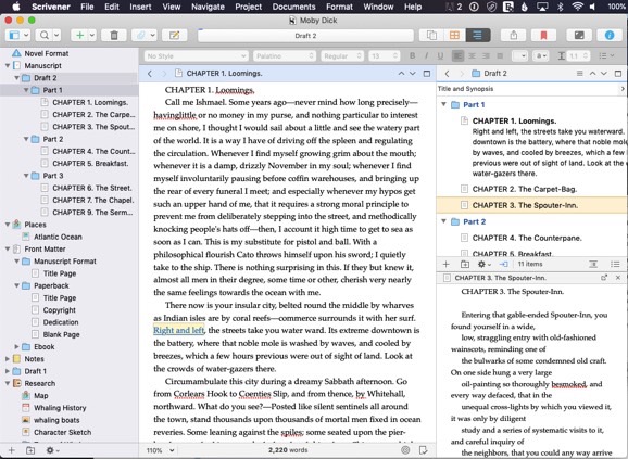
This one can be really handy if you like to keep a lot of windows open and or write in more than one section at a time. Here’s what it looks like:

And here’s how it works:
You use the Binder as usual to load the what displays in the main editor (in the photo above, the main editor is showing Chapter 1, and this is where you would type while working).
To change what shows in the Outliner (the top right section) you drag and drop from your Binder to the Outliner’s header bar. In the image above, this is the bar on the top right that says “Draft 2” because I dragged the file folder for Draft 2 to that bar.
What you click on in the Outliner is what will show up in the bottom right. In this example, you can see that I clicked on Chapter 3 in the Outliner (top right window) and so the contents of Chapter 3 are what are on display in the bottom right.
It’s worth noting that you can edit in that bottom right window as well as in the main editor. This can work similarly to using a Split Screen.
So Many Choices
Seven different layouts to choose from. Personally, I almost always go with Default, but it’s nice to know those others are available.
Leave a Reply